Social media is a great way for us as designers to share our work with others online. Possibly the best platform for this is Pinterest. While most other social media revolves around text or sharing interesting articles, Pinterest is a purely visual medium, making it the perfect choice for putting our portfolio pieces on a virtual pedestal for the world to see. In order for a Pinterest photo to be widely shared, it is essential that it be pinned and repinned by the masses. The trouble is, there was never any way of knowing what kinds of photos garner the most repins. But thanks to Philadelphia based startup Curalate, we now have a pretty good idea about what makes for a popular Pinterest photo. If you can work some of these elements into your portfolio photos, you will increase the likelihood that your work will be shared in front of a worldwide audience of other designers looking for inspiration, as well as potential clients. So what factors increase a photos “pinnability?”
Hold the Faces
According to Curalate’s research, images with no human faces were repinned 23% more often than images with faces. As designers, this is generally good news, since our portfolio pieces are photographed on their own anyway. Unless a face is integrated into the work itself. It is unclear at this point whether a photo of a photo of a face would hurt the chance of repins.
“Real” Contextual Backgrounds are Best
It was found that objects that are photographed in a natural context fared much better than those that had a fake or Photoshopped background. In the design portfolio realm, this would suggest that you would be better off actually photographing your work on a wooden table or another surface that compliments the piece, rather than faking it digitally.
Multiple Colors For the Win
In general, photos that feature more than one color get more than three times as many repins as images with just one main color. Unfortunately, there isn’t much we can do with this information in regard to our portfolio pieces, since the colors are what they are. I would never suggest putting Pinterest attention before the needs of your client. Having said that, if placing the portfolio item on a contrasting background works in a non-distracting way, that could be interesting and worthy of increased sharing.
Warm it Up
Photos that are primarily red or orange get twice as many repins as blue and green photos. Again, not much you can do with this, the colors in the design will determine the colors in the photo.
Easy Does it on Saturation
You might think that bright, bold photos would be the most popular, but you would be dead wrong. For whatever reason, images that sit around 50% saturation get repinned four times as often as full saturation photos. But if you go too far in the other extreme, you will get burned as well; Black and white photos do even worse than full color saturation.
This is a tricky one for designers. Do we risk altering the saturation of our portfolio photos just to appease the Pinterest Gods? It might work well for certain types of projects, and for certain types of clients, and not so well for others. For instance, a brochure for a dog groomer might work well when photographed at 50% saturation, but a website for a new energy drink? Not so much. Again, never let your work be misrepresented in an effort to gain more pins.
Keep it Vertical
Who would have thought that the orientation of a photo would make a difference in its popularity? It turns out, however that it plays a big part. Portrait style photos get more repins than their landscape counterparts, mainly to do with the way Pinterest resized and alters landscape photos to fit. Depending on your project, it may make sense to photograph it in portrait orientation, and it might not. If it would absolutely result in a better image to go with a horizontal layout (as in the case of an unfolded brochure,) then go with it. But all things being equal, and if it doesn’t make much of a difference, then go with portrait.
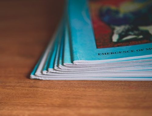
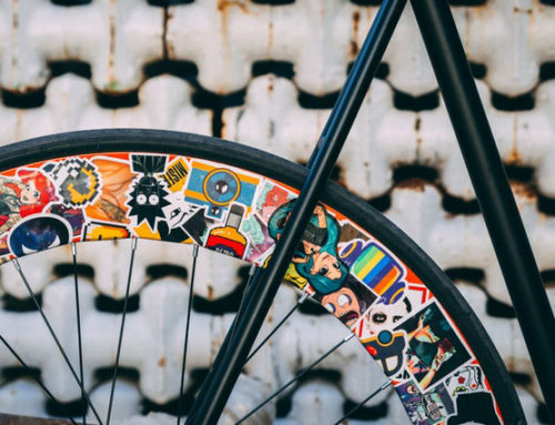
Examples:


Photo credits: Alejandro Torres Viera, Eric Warner, Isaac Sanchez
Final Thoughts
Getting your work in front of the right people begins by getting it in front of a lot of people. Pinterest is a fantastic way of building an audience and making a name for yourself, but keep in mind that not all images are created equal. We now know the various elements that go into a popular Pinterest photo, so use them when they make sense. I happen to believe that this research doesn’t stop at Pinterest. If these are the marks of popular photos that people enjoy sharing, I would think that the same characteristics would make the photos on your portfolio site more memorable as well.
 Written by Wes McDowell: Wes McDowell is the Principal and Creative Director for The Deep End, a graphic and web design studio in Los Angeles In addition to client work, he has authored several books for freelance designers and co-hosts a popular graphic design podcast called “The Deeply Graphic DesignCast.” Follow Wes on Google+



Leave a Reply